
Can a watch suggest motion before its hands move? Arceau makes that question worth asking. Instead of beginning with the mechanism, look at the outline and the marks that make the time readable. A small deviation can change the character of an otherwise orderly object. Here, the fascination lies in how a circle acquires direction without ceasing to be a circle.
A circle with an interruption
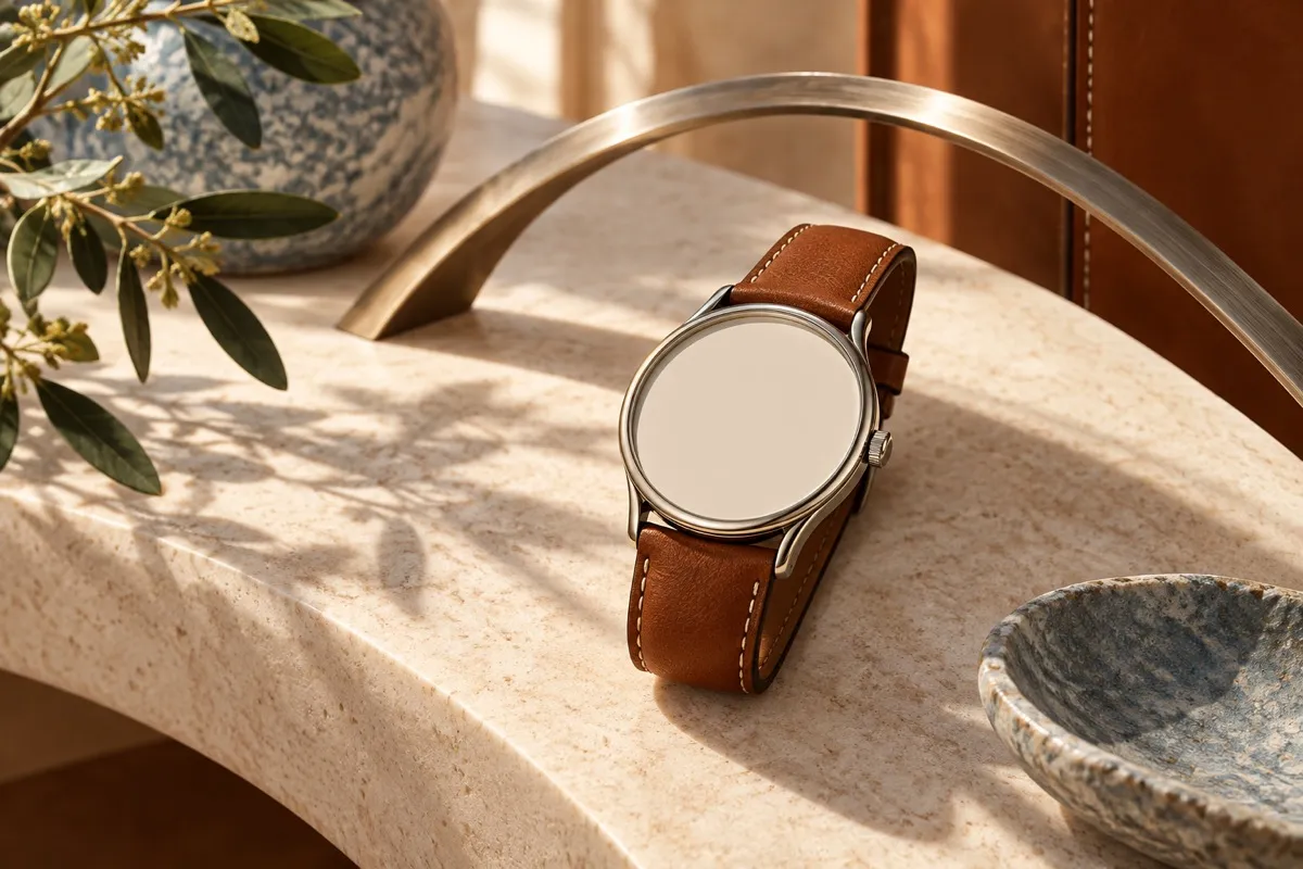
Henri d’Origny created Arceau in 1978. Hermès describes a round case with asymmetrical attachments inspired by stirrups. Those attachments, or lugs, are where case and strap meet. Giving this junction an unusual shape moves attention towards something that could easily be treated as background. The equestrian reference is therefore built into a connection, rather than simply placed on the watch as a picture.[1][+][+]
Asymmetry makes that connection active. In a perfectly balanced outline, the eye can settle almost immediately. A difference between the two ends invites comparison: what appears to extend, what seems contained, where does the strap begin? These are questions about visual balance, not claims about mechanical performance. D’Origny’s design encourages a second look at an object that usually receives only a glance.
Movement without a moving picture
The dial adds another kind of movement. Its hour markers lean and Hermès connects that slant with the movement of a galloping horse. The association is the house’s own explanation, not a requirement for every viewer. Even without naming the horse, it is possible to read the lettering as a change of pace: the marks seem less planted than they would if they stood upright.[1]
This is a compact lesson in how an allusion can work. A designer need not reproduce a whole scene to suggest it. The direction of a mark and the shape of an attachment can carry the reference between them. Try covering the dial in an image, then covering the strap connections. Each part offers a different clue; together, they make the watch more specific than either one alone.
A later invitation to pause
A later Arceau asks whether a watch can offer a pause as well as a reading. Hermès’s 2012 Annual Report places Le Temps Suspendu in 2011. In its description of a modern version, the house explains that pressing a button brings the hands together at the top of the dial, with their movement resuming on demand. The point is a deliberate interruption of the display, not a literal claim that time stops.[2][3][+]
That later idea should not be mistaken for a feature of every Arceau, or projected back onto the 1978 design. It offers a different conversation with the wearer. The earlier visual cues suggest motion; the later complication proposes a momentary refusal to keep looking at it. Reading the two together is an interpretation of the family’s possibilities, not evidence that the original designer planned every subsequent watch.
The broader history of Hermès watches and designed objects supplies the institutional setting. Arceau rewards a closer, slower scale of attention. Look first at the joins, then at the lettering and only afterwards ask what lies beneath the dial. A watch can measure an interval while also changing the way we attend to it.
Sources & further reading
- Arceau watch, 40 mm · HermèsThe story behind, line 100, first sentence · The story behind, line 100, second sentence · The story behind, line 100, third sentenceConsulted 2026-10-27
- 2012 Annual Report · Hermès InternationalPrinted p.18 / physical PDF p.20, 2011 entry, lines 499–505Consulted 2026-10-27
- Arceau Le Temps Suspendu watch, 42 mm · HermèsThe story behind, lines 101–102Consulted 2026-10-27